Poster Guidelines
Posters are one way in which scientists present their research results. When posters are displayed at conferences, researchers have the opportunity to discuss their findings and ideas with fellow scientists.
At a poster session, people tend to spend the most time looking at posters that are attractive, well organized, and easy to read. It’s best to keep the text short and to illustrate your points with graphs, photos, and diagrams.
To make your poster effective, make sure that it is:
Readable – Can your text be read from 2 meters away? (20 points is a good font size)
Understandable – Do your ideas fit together and make sense?
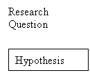
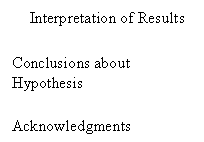
Organized – Is your work summarized clearly and concisely, using the headings listed in the example below?
Attractive – Will your poster make viewers want to take the time to read it? Have you used illustrations and color to enhance your display, without making the text hard to read?
Here is an example poster layout:
1.2 meters
Procedure![]()
![]()
![]()
![]()
![]()
![]()
![]()
![]()
Title Graphs, Photos,
and Illustrations


![]()
